
Histograms are one of the most misunderstood topics in school mathematics.
Many students assume the tallest bar always means the highest frequency — and that’s where mistakes begin.
This is why the frequency density formula exists.
In IB Maths, GCSE, IGCSE, and A-Level statistics, histograms often use unequal class widths. When that happens, frequency alone cannot be used to represent data fairly. Instead, we use frequency density.
Frequency density tells us how concentrated data values are within a class interval.
Instead of asking:
“How many values are there?”
We ask:
“How many values are there per unit of class width?”
This allows us to compare groups fairly — especially when class widths are different.
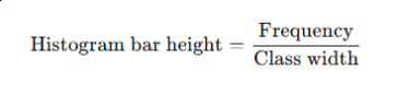
👉 In a histogram:
Height of bar = frequency density
Area of bar = frequency
This single idea explains everything about histograms.
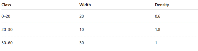
Consider this data:
| Class Interval | Frequency |
|---|---|
| 0–10 | 20 |
| 10–30 | 20 |
At first glance, both groups have the same frequency.
But notice:
First class width = 10
Second class width = 20
If both bars were drawn the same height, the second class would visually represent twice as much data per unit, which is misleading.
👉 Frequency density fixes this problem.
Formula for Frequency Density
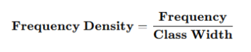
This is the core formula you must know for:
IB Maths AA & AI
GCSE Higher
IGCSE Extended
A-Level Statistics
1. Frequency
This is simply:
The number of values in a class interval
Example:
15 students scored between 60 and 70 → frequency = 15
2. Class Width
Class width is the size of the interval, not how many values are in it.
Class width=Upper boundary−Lower boundary
Example:
Class: 20 ≤ x < 35
Width = 35 − 20 = 15
📌 IB examiners care a lot about boundaries, so always use correct class limits.
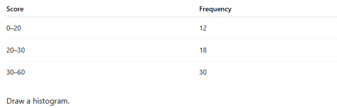
Let’s walk through a typical IB-style example.
Given:
| Class Interval | Frequency |
|---|---|
| 0–10 | 25 |
| 10–20 | 40 |
| 20–50 | 30 |
Step 1: Find Class Widths
| Class | Width |
|---|---|
| 0–10 | 10 |
| 10–20 | 10 |
| 20–50 | 30 |
Step 2: Apply the Frequency Density Formula

Step 3: Draw the Histogram
Horizontal axis → class intervals
Vertical axis → frequency density
Heights → 2.5, 4, and 1
✔ Area of bars correctly represents frequency
✔ Histogram is mathematically accurate
Histogram Frequency Density Formula (Exam Wording)
In exams, you may see phrases like:
“Calculate the frequency density”
“Find the height of each bar”
“Complete the histogram”
They all mean the same thing:
This is the most important conceptual idea.
Two bars:
Bar A: width 10, height 4 → area = 40
Bar B: width 20, height 2 → area = 40
Even though heights differ:
Frequencies are the same
👉 Area = frequency
👉 Height = frequency density
This idea appears repeatedly in IB exam questions.
Many students like visual memory tools.
Frequency Density Triangle
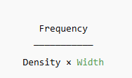
How to use it:
Cover the value you want
The remaining two show the operation
Examples:
Density = Frequency ÷ Width
Frequency = Density × Width
✔ Very useful under exam pressure
✔ Reduces rearranging errors
You might see slightly different wording:
Density frequency formula
Formula of frequency density
Formula to find frequency density
They all refer to the same mathematical relationship.
The formula never changes — only the wording does.
In some statistics courses, especially later IB or university prep, you may encounter relative frequency density.
Relative Frequency Density Formula
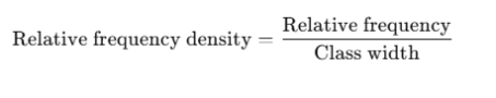
Where:
Relative frequency = frequency ÷ total frequency
This is useful for:
Comparing datasets of different sizes
Probability density concepts
📌 Not heavily tested in IB, but useful conceptually.
IB Maths AA SL & HL
IB Maths AI SL & HL
Internal Assessments (data analysis)
Paper 2 & Paper 3 questions
✔ Correct calculation of class widths
✔ Correct frequency density values
✔ Correctly scaled histogram
✔ Clear interpretation of areas
❌ Using frequency as bar height
❌ Ignoring unequal class widths
Question:
The table shows the distribution of test scores.
Calculate class widths
Calculate frequency densities
Label axes correctly
Draw bars with correct heights
❌ Mistake 1: Using frequency as height
This is the most common error.
❌ Mistake 2: Forgetting class width
Always calculate it — even if classes look equal.
❌ Mistake 3: Incorrect axis labels
Vertical axis must say frequency density, not frequency.
❌ Mistake 4: Comparing heights instead of areas
Examiners want interpretation based on area.

A great classroom method:
Draw rectangles with equal area but different widths
Show how height changes to maintain area
This visual approach helps students understand why the formula exists, not just how to use it.
If your child is confused:
Ask: “Which bar has the bigger area?”
Avoid asking: “Which bar is taller?”
That small change improves understanding quickly.
Once understood, frequency density makes perfect sense.
Think of it like:
Speed = distance ÷ time
Density = frequency ÷ width
It’s simply a rate, not a total.
It is frequency divided by class width.
Because class widths can be unequal, and frequency alone would misrepresent the data.
It shows how concentrated data values are per unit interval.
Upper boundary minus lower boundary.
Yes — especially in data interpretation questions.
A visual tool showing the relationship between frequency, density, and class width.
Using frequency instead of frequency density for histogram height.
IB Demystified is a trusted online learning platform led by certified IB examiners and educators.
© 2026 IB Demystified LTD ALL RIGHTS RESERVED. Powered by AfiaDigital
WhatsApp us